Modify chart data in Numbers on iPad
You can modify a chart’s data references (numbers, dates or durations) at any time. You can add and remove an entire data series, or edit a data series by adding or deleting specific data from it.
Note: Some options may be different for pivot charts.
While you’re editing a chart’s data references, a dot appears on the tab of each sheet that contains data used in that chart.

If you can’t edit a chart, it may be locked. Unlock it to make changes.
Add or delete a data series
Go to the Numbers app
 on your iPad.
Open a spreadsheet, tap a chart, tap
 , then tap Edit References.
Do any of the following:
Remove a data series: Tap the dot for the row or column you want to delete, then tap Delete Series.
Add an entire row or column as a data series: Tap the header cell for the row or column. If there is no header cell, drag to select the cells in the row or column.
Add data from a range of cells: Touch and hold, then drag across the table cells.
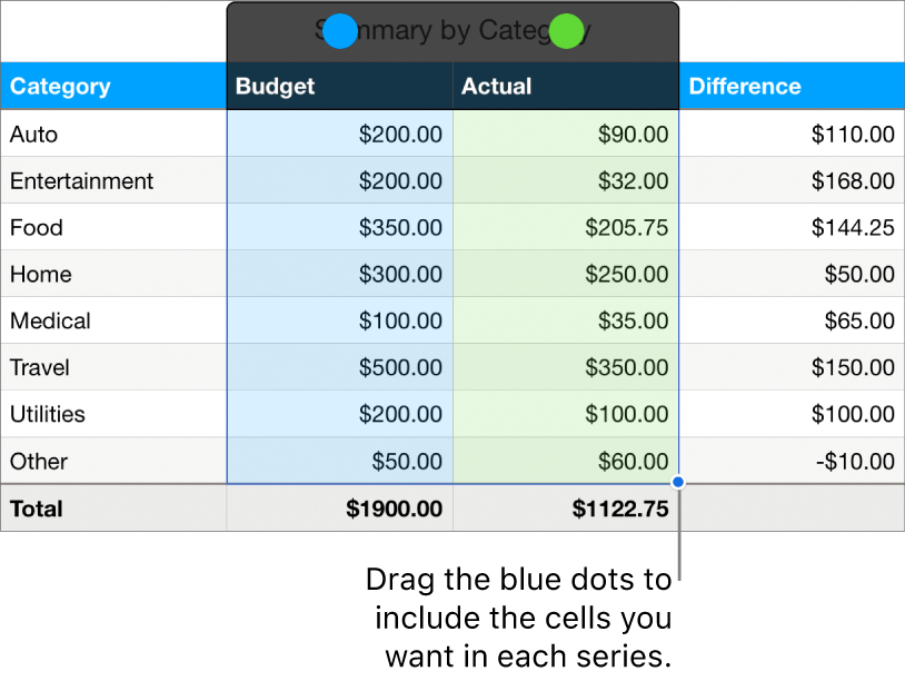
Add or remove data from an existing data series: Tap the dot for the row or column, then drag the blue dot at the corner of the selection box to include the cells you want.
Change the data that is plotted in a pivot chart: Tap a dot for any column, tap Include Data From, then tap the Column, Row or Value data you want to plot.
When you’ve finished, tap
 .
.
Resize individual data series
Go to the Numbers app
 on your iPad.
Open a spreadsheet, tap a chart, tap
 , then tap Edit References.
Tap
 in the toolbar, then turn on Show Each Series.
Drag the blue dots to include only the cells you want in each series.

Tap
 to return to the chart.
Switch rows and columns as data series
When you add a chart, Numbers defines the default data series for it. In most cases, if a table is square or if it’s wider than it is tall, the table rows are the default series. Otherwise, the columns are the default series. You can change whether rows or columns are the data series.
If your table contains categories and you choose a column as the data series, you can also choose whether you want the chart to include summary or body cells.
Go to the Numbers app
 on your iPad.
Open a spreadsheet, tap a chart, tap
 , then tap Edit References.
Tap
 , then tap Plot Rows as Series or Plot Columns as Series.
Tap
 .
.
Include hidden data in a chart
When you import a spreadsheet that includes hidden data (data in hidden rows or columns, or data hidden due to data filtering), you can choose to include that hidden data in your charts. By default, hidden data isn’t included.
Go to the Numbers app
 on your iPad.
Open a spreadsheet, tap a chart, tap
 , then tap Data.
Turn on Show Hidden Data.
For more information about how to hide table rows or columns, see Add or remove rows and columns.
About chart downsampling
If a column, bar, line or area chart references a table with a large number of data points, the chart automatically shows a representative sample of each series to improve the performance of Numbers. Downsampling doesn’t change or remove the data in your table, and only changes the visible data points in the chart.
If your chart data is being downsampled, a message appears when you tap Large Data Set in the Chart tab of the Format ![]() menu.
menu.
If you want to see certain data points in your chart, you need to create the chart from a smaller table or a smaller selection of data from a large table.