
Modify graph data in Keynote on Mac
You can modify a graph’s data references (numbers, dates or durations) at any time. You can add and remove an entire data series, or edit a data series by adding or deleting specific data from it.
Add or delete a data series
Go to the Keynote app
on your Mac.Open a presentation, click the graph, click Edit Graph Data, then do any of the following:
Add a data series: Click a cell in a new column or row in the Graph Data editor, enter your data, then press Return or Tab. Repeat these steps until you’ve entered the entire data series.
Remove a data series: Click the bar for the row or column you want to delete, click the arrow that appears, then click Delete Row or Delete Column (depending on whether you plotted rows or columns as data series).
Reorder data series: Drag a bar to re-order the data series.
Add a currency symbol or other formatting: Click the Series tab at the top of the sidebar on the right, then use the controls to add value labels or other formatting.
Close the Graph Data window to return to the graph.
Switch rows and columns as data series
When you add a graph, Keynote defines the default data series for it. In most cases, if a table is square or if it’s wider than it is tall, the table rows are the default series. Otherwise, the columns are the default series. You can change whether rows or columns are the data series.
Go to the Keynote app
on your Mac.Open a presentation, click the graph, then click the Edit Graph Data button.
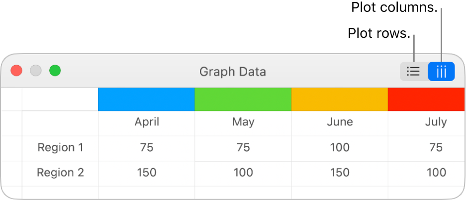
Click a row or column button in the top-right corner of the Graph Data editor.
Close the Graph Data editor when you’re done.

Share the x-axis for multiple values along the y-axis for scatter and bubble charts
Sharing the x-axis means plotting a single kind of value along the x-axis, while allowing for multiple kinds of values plotted along the y-axis. By default, the x-axis values are shared among multiple sets of y-axis values in some types of graphs.
Go to the Keynote app
on your Mac.Open a presentation, click the graph to select it, then click the Edit Graph Data button.
Click
 , then select Share X Values.
Close the Graph Data editor when you’re done.
About graph downsampling
If a column, bar, line or area graph references a table with a large number of data points, the graph automatically shows a representative sample of each series to improve the performance of Keynote. Downsampling doesn’t change or remove the data in your table, and only changes the visible data points in the graph.
If your graph data is being downsampled, a message appears when you click Large Data Set in the Graph tab of the Format ![]() sidebar.
sidebar.
If you want to see certain data points in your graph, you need to create the graph from a smaller table or a smaller selection of data from a large table.