
Apple Business Connect Image Style Guide
This guide walks you through requirements, best practices, and tips for images and logo placements on your Place Card.

Make your logo and photos look great
Your logo and photos are an important way to highlight your brand and build a strong brand identity across Apple features. Here are some best practices and tips to make each of your images stand out.
Brand logo
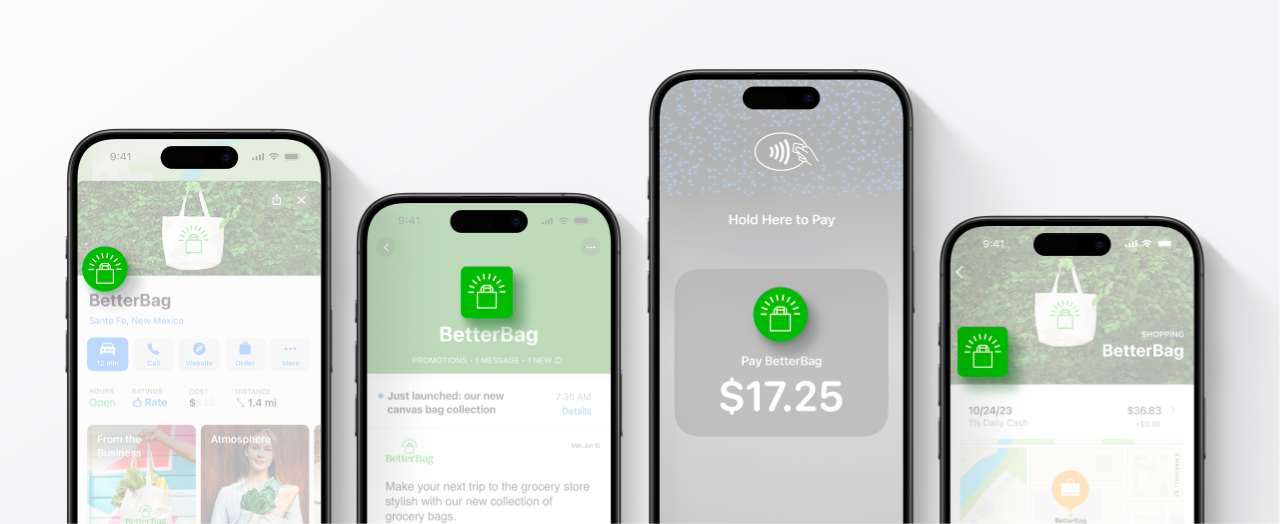
Your brand logo is a unique graphic element that helps customers identify you or your business across Maps, Branded Mail, Tap to Pay on iPhone, and Apple Wallet after you set up those features.
Best Practices
Follow these best practices to ensure your logo is clear and recognizable.
  Use a high-quality image. |  Upload an image with a solid background. |  Maximize the space to ensure the brand is legible. |
  Don’t place the logo too close to the side edges. |  Don’t place the logo on a transparent background. |  Don’t make the logo too small when cropping. |
Location photos
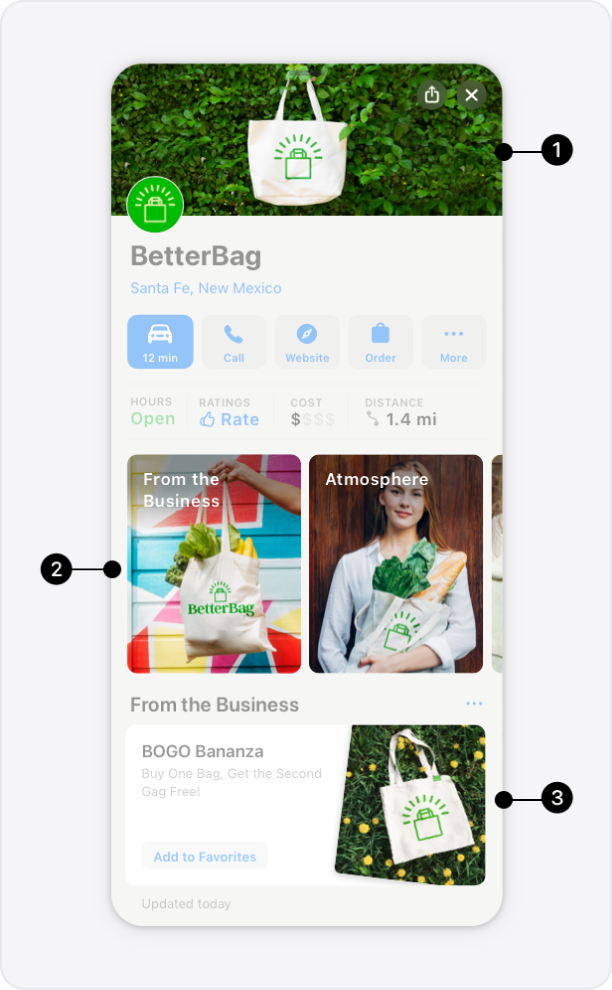 | Photos make your location distinct and create a strong first impression with customers. You can add photos to the following parts of your Place Card.
|
Best Practices
Here are some best practices to ensure your images capture the best of your business.
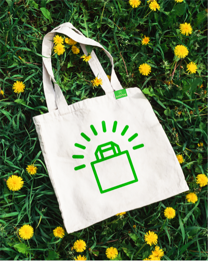 Use colorful, high-quality, engaging photos. |  Ensure photos are well lit and in clear focus. |  Capture the experience and quality of your business. |
 Don’t use busy backgrounds, multiple photos, or collages. |  Don’t include sales, pricing, or text in the photos. |  Avoid placing subjects too close to the side of crop margins. |