Prepare your logo for the Health app
When users look for organizations in the Health app, logos appear with their names. It’s recommended that you supply a logo that helps your patients recognize your organization.

In the Health app, logos appear with a thin, white border. For the best display, supply a color logo with a transparent background. Solid, non-white backgrounds are not recommended.
When you supply a logo, use an image file with the following characteristics:
PNG or JPEG format
2 MB maximum size
A transparent alpha channel for background areas
1024 x 1024 pixels in dimension
Tip: If you need to resize your logo’s dimensions to 1024 x 1024 pixels, you can search the web to find many free online tools for resizing PNG and JPG images. If you use one of these tools and your logo has background areas, be sure your logo doesn’t lose its transparent alpha channel.
If your organization has multiple brand names, you can supply each with its own logo.
Note: If you don’t supply a logo, a circle containing the first letter of your organization or brand name is automatically supplied for a logo.
Tips for ensuring the legibility of your logo
Your logo will be reduced, when needed, for specific devices and areas of the screen. In some cases, a logo will be reduced to a size smaller than 50 x 50 pixels. As a result, horizontally oriented logos and logos made up of lengthy phrases lose clarity when reduced. To help your logo maintain clarity, consider the following:
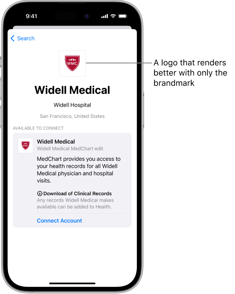
If your logo consists of a brandmark and a wordmark: Separate them and use only the brandmark.
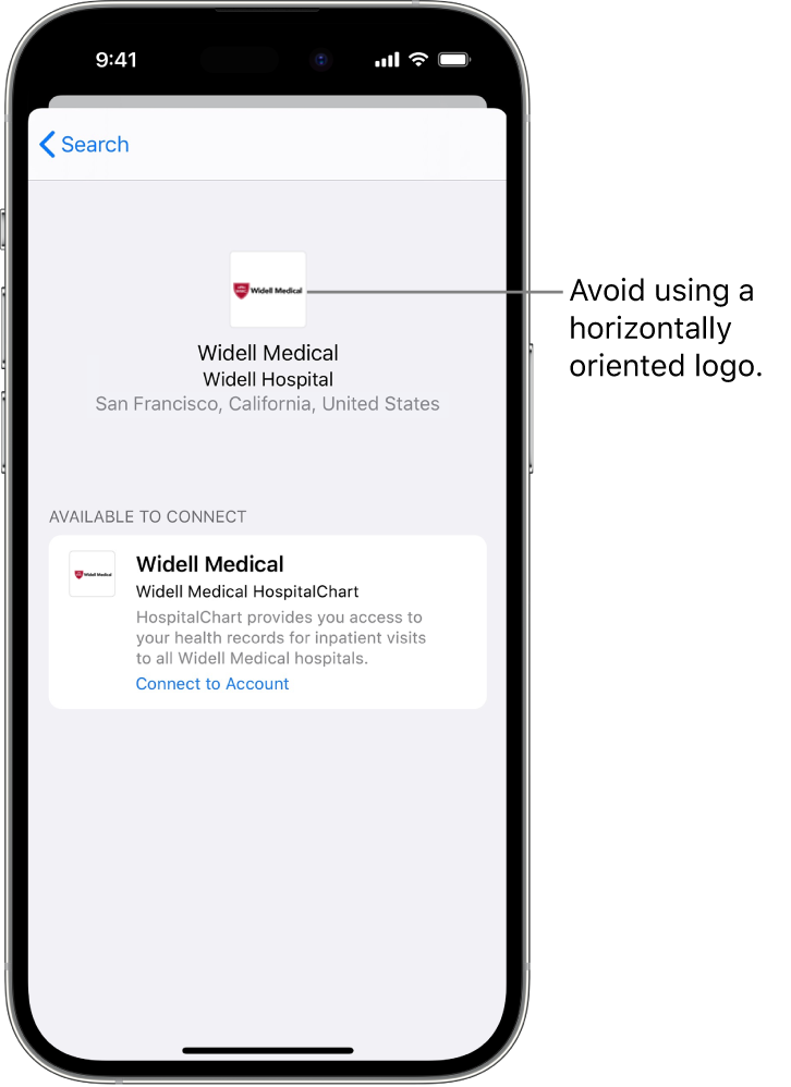
If your organization’s logo is predominantly horizontal: Create a vertically oriented logo that can be scaled down and still be recognized.
If you must adhere to logo lockup requirements by your brand or marketing teams: Explore how to create logo assets that will scale down with clarity.
For example, the screenshot below shows a horizontally oriented logo consisting of a brandmark and a wordmark.
As shown next, replacing the brandmark and wordmark with only the brandmark greatly improves the logo’s clarity.