
Add a legend, grid lines and other markings in Pages on Mac
There are several types of graph markings and axis labels you can add to your graphs. You can modify their look to emphasise your data, you can style the graph title and value label text differently to make them stand out from the other text.
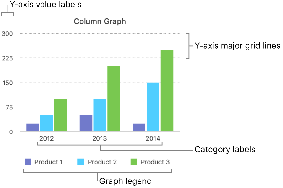
Add a legend
Click the graph, then in the Format
 sidebar, click the Graph tab.
In the Graph Options section, select the Legend tick box.
In your document, click the legend (to select only the legend), then do any of the following:
Change the look of the legend text: Click the Style tab at the top of the sidebar, then use the controls to add a background fill, add a border and more.
Resize the legend: Drag the square handles around the legend.
Drag the legend to where you want it.
You can position the legend more precisely by selecting it, then pressing the arrow keys on your keyboard. Pressing Shift-arrow moves the legend in larger steps.
Modify axis grid lines
You can specify whether to show graph grid lines and modify their look.
Click the graph.
In the Format
 sidebar, click the Axis tab, then choose Value (Y) or Category (X) for the axis you want to modify.
Do any of the following:
Set the line type: Click the disclosure arrow next to Major Gridlines or Minor Gridlines (in the Value tab), or Gridlines (in the Category tab), then click the pop-up menu and choose a line type.
If you’re working with a radar chart, you can also click the pop-up menu below Radial Lines (in the Category tab) and choose a line type.
Set the line colour: In either the Major Gridlines section or the Minor Guidelines section, click the colour well or colour wheel, then choose a colour.
Set the number of major gridlines: In the Axis Scale section, click the arrows to the right of the Major field or type a value in it.
Show ticks: Click the Ticks pop-up menu, then select a location.
Extend radial lines (for radar graphs): Select Extend Radial Lines.
Show or remove reference lines
You can add reference lines to a graph to mark the average, median, minimum and maximum values. Reference lines make a graph easier to interpret at a glance and can help you compare the values in the graph to a benchmark value.
All chart types can have reference lines except stacked charts, 2-axis charts, 3D charts, pie charts, donut charts and radar charts. A graph can have up to five reference lines.
Click the graph to select it.
In the Format
 sidebar, click the Axis tab, then click the Value button near the top of the sidebar.
Click the disclosure arrow next to Reference Lines, then choose any of the following types of reference lines from the pop-up menu:
Average: A line that runs through the mean value of the data
Median: A line that runs through the middle value of the data
Minimum: A line that runs through the lowest value of the data
Maximum: A line that runs through the highest value of the data
Custom: A line that runs through a value you enter in the Custom section of the sidebar
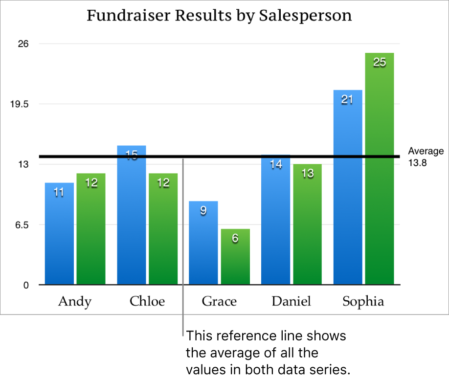
To show what the reference line represents, select the Show Name and Show Value tick boxes.
To change the settings for a reference line, click the line, then use the controls in the Reference Line tab in the sidebar on the right.
Note: When you drag the slider on an interactive graph to view different data sets, its reference lines move.
To remove a reference line, click the line to select it, then press Delete on your keyboard.
Show or remove error bars
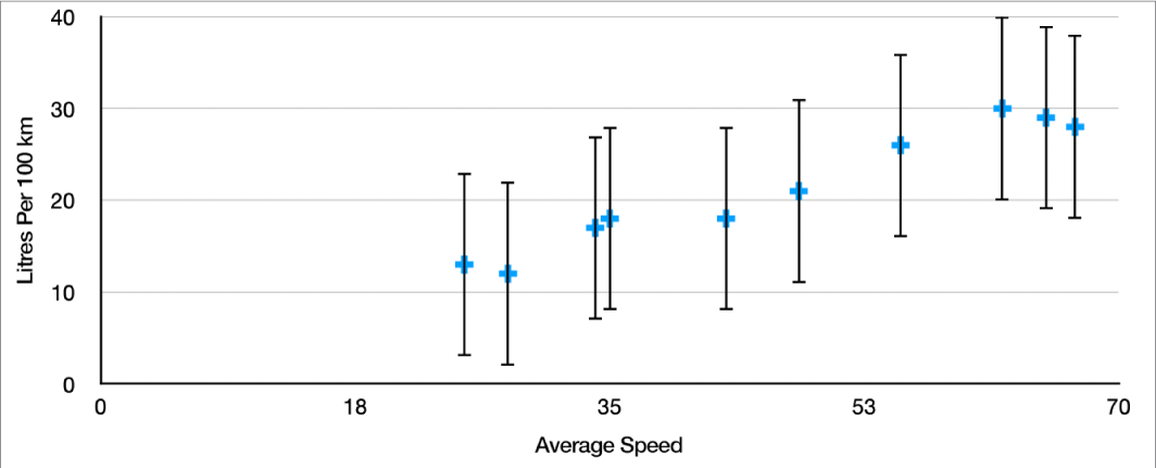
Error bars give a general impression of your data’s accuracy. They’re represented as small marks whose length indicates the amount of uncertainty associated with a given data series (the data’s variability). You can add them to 2D line graphs, area graphs, bar and column graphs, stacked bar and column graphs, bubble charts and scatter plots.
Click the graph, then in the Format
 sidebar, click the Series tab.
Click the disclosure arrow next to Error Bars, then click the pop-up menu and choose a type of error bar.
For scatter plots and bubble charts click a pop-up menu below X Axis Error Bars, or Y Axis Error Bars, then choose a type of error bar.
Click the second pop-up menu, select how error values are calculated (for example, as fixed values or percentages), and change the range of variability you want to display.
To change the look of the error bars, click an error bar so you see white dots at either end.
All error bars for that data series are selected.
Use the controls in the Bar Style and Shadow sections of the sidebar to make changes.
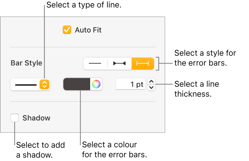
Only the error bars for the selected data series are modified. To change error bars for another series, click one of its error bars, then make changes.
When you create a graph, Auto-Fit is automatically turned on for error bars to prevent overlap. To see all error bars, unselect the tick box next to Auto-Fit.
To remove error bars, click the chart, click an error bar, then click the Error Bars pop-up menu in the sidebar and choose None.
Show or remove trendlines
Trendlines show you the overall direction (or trend) of your data. Trendlines appear in bar, line, scatter, bubble, column and area graph.
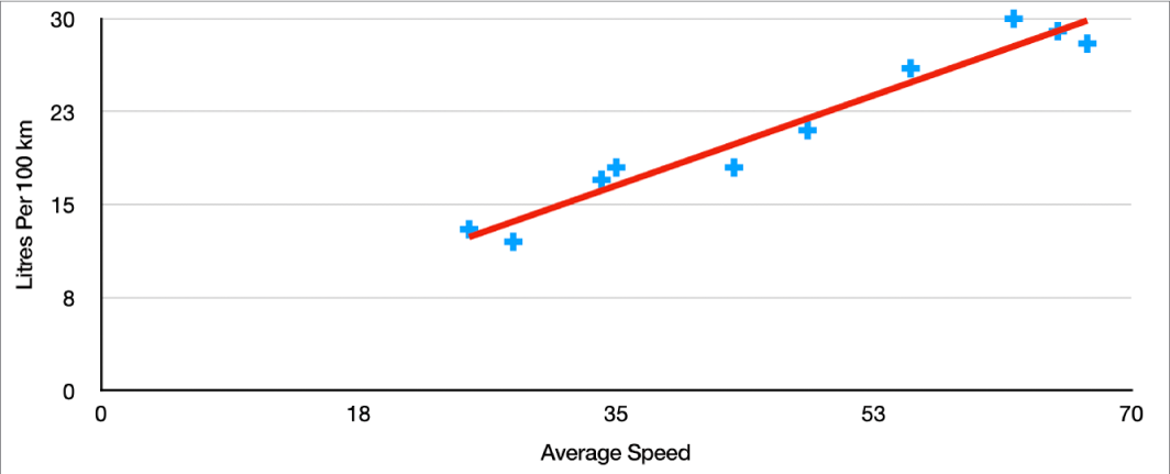
Click the graph, then in the Format
 sidebar, click the Series tab.
Click the disclosure arrow next to Trendlines, then click the pop-up menu and choose a type of trendline.
Do any of the following:
Show names for the trendlines: Select the Name tick box, then type a name in the field. The name you type appears for all trendlines on the graph. To change a name, double-click it on the graph, then type a new one.
Show the equation or R-squared value: Select the Show Equation or Show R 2 Value tick box.
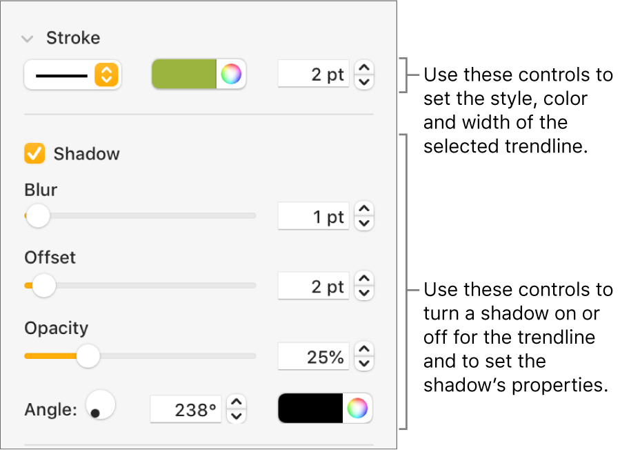
To change the look of a trendline, click the line so you see white dots at either end, then use the controls in the Stroke and Shadow sections of the sidebar to make changes:
To remove trendlines, click the graph, click a trendline, then click the Trendlines pop-up menu in the sidebar and select None.