
Change the look of bars, wedges and more in Pages on iPhone
A data series is a set of related values in a chart — for example, all the bars of the same colour in a bar chart, or a single line in a line chart.
You can emphasise trends in your chart by changing the appearance, position or spacing of one or more of the data series.
Change colours and shadows in chart elements
You can change the look of any data series in a chart to differentiate it from other series. For bar charts, for example, you can fill the bars in each series with a different colour or a colour gradient, apply a different outline (stroke) style and more. For scatter charts, you can change the symbol that represents each point and add connection lines between the points.
Note: You can’t change the look of a single data point in a series (a single bar in a bar chart, for example). All changes you make apply to every data point in the series.
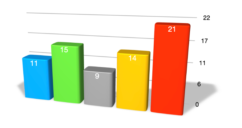
Tap the chart, then tap Edit Series.
Tap the series you want to edit, then use the controls in the menu to make changes.
The changes affect only the selected data series. To change another series, tap All Series, tap the series you want to edit, then make changes.
To edit multiple series, tap Select, tap two or more series, then tap Format Selected Series.
Tip: You can choose a coordinated set of colours for all the data series in the chart at once. Tap the chart, tap ![]() , then tap a style in the Chart tab.
, then tap a style in the Chart tab.
Change the spacing in bar or column charts
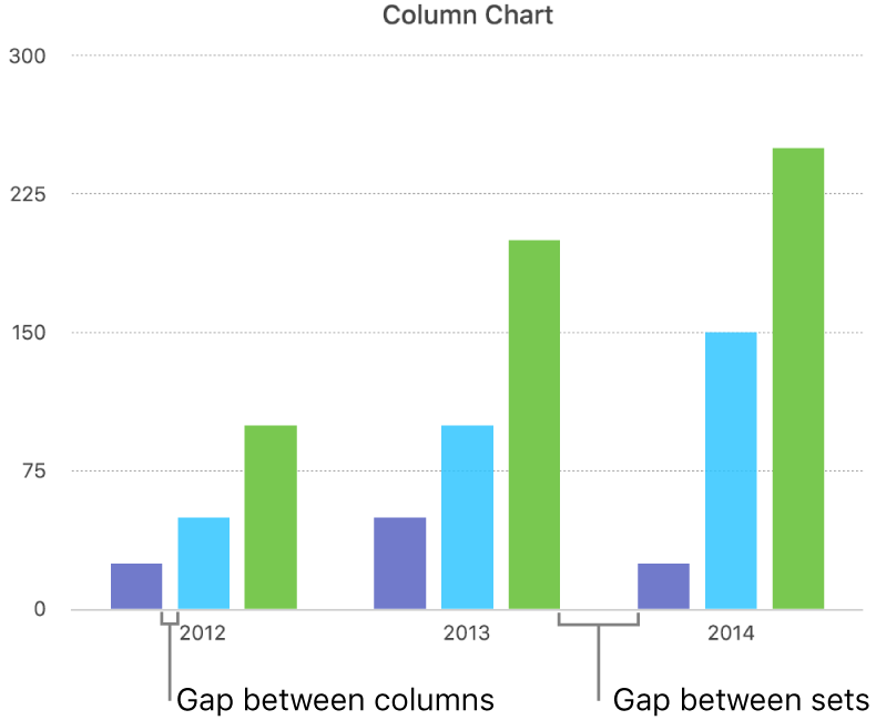
You can set the amount of space between the columns or bars in a column, stacked column, bar or stacked bar chart.
Tap the chart, tap
 , tap Style, then tap General.
To set the amount of space, drag the slider for Gaps Between Columns, Gaps Between Bars or Gaps Between Sets, or tap a percentage and enter a new value.
Add rounded corners to bar, column, mixed and two-axis charts
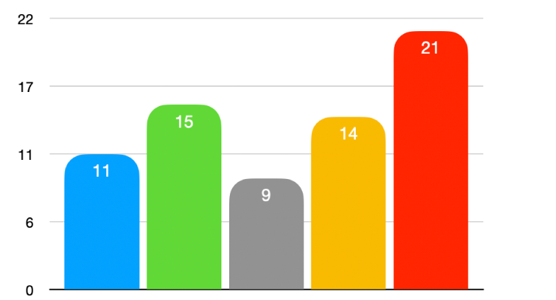
Tap the chart you want to change, tap
 , then tap Style.
To adjust the roundedness of the bars or columns, drag the Rounded Corners slider, or tap the percentage under Rounded Corners and enter a new value.
If you can’t see the Rounded Corners slider, swipe up from the bottom of the controls.
To round only the two outside corners of each bar or column (those furthest from the axis), turn on Outside Corners Only.
Change the depth of a 3D chart and the shape of series elements
You can change the chart depth and the shape of columns or bars for a 3D chart.
Tap the chart to select it.
Tap
 , then tap Chart.
Swipe up to see the Depth slider (if you can’t see it), then do any of the following:
Adjust the depth: Drag the Depth slider to the right to make the chart appear deeper, or drag it to the left to make it appear less deep.
Change the shape of columns or bars: Tap Column Shape or Bar Shape, then tap either Rectangle or Cylinder.
Bevel the edges between series or wedges in 3D stacked and pie charts
You can increase the distinction between series in 3D stacked bar or column charts and 3D pie charts by bevelling the edges where the series meet.
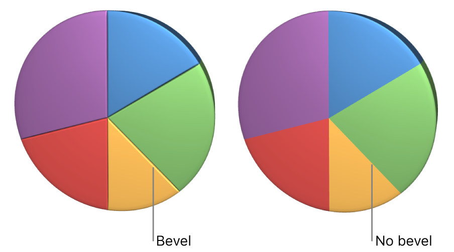
Tap the chart, then tap
 .
.Tap Chart, then turn on Bevels.
The bevels control appears only when a 3D stacked bar chart, 3D stacked column chart or 3D pie chart is selected.
If you can’t see Bevels, swipe up from the bottom of the controls.
Change the position of pie chart wedges or doughnut chart segments
Select the pie or doughnut chart.
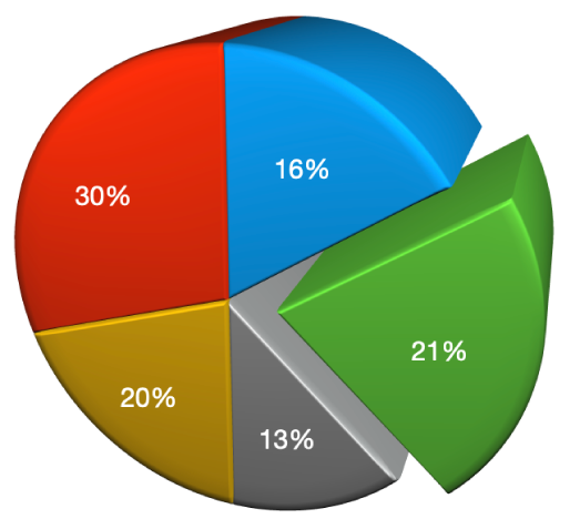
Touch and hold the wedge or segment, then drag away from the chart’s centre.
You can also move the Rotation Angle control to change the orientation of pie wedges or doughnut segments. See Move, resize and rotate a chart in Pages on iPhone.
Resize the centre hole of a doughnut chart
Tap the doughnut chart to select it, then tap
 .
.Tap Chart, then drag the Inner Radius slider, or tap the percentage below Inner Radius and enter a new value.
Add or change data symbols in line, scatter and radar charts
You can change the symbols used to represent data in line, scatter and radar charts.
Tap the chart to select it, tap
 , then tap Style.
Tap Data Symbol, then choose a symbol, or choose None to remove symbols from the chart.
You can also increase or decrease the size of the symbols by tapping
 next to Size or set the size to Auto for automatic sizing.
Change the grid style of radar charts
You can change the shape of the grid on a radar chart and choose whether the series have a fill or stroke.
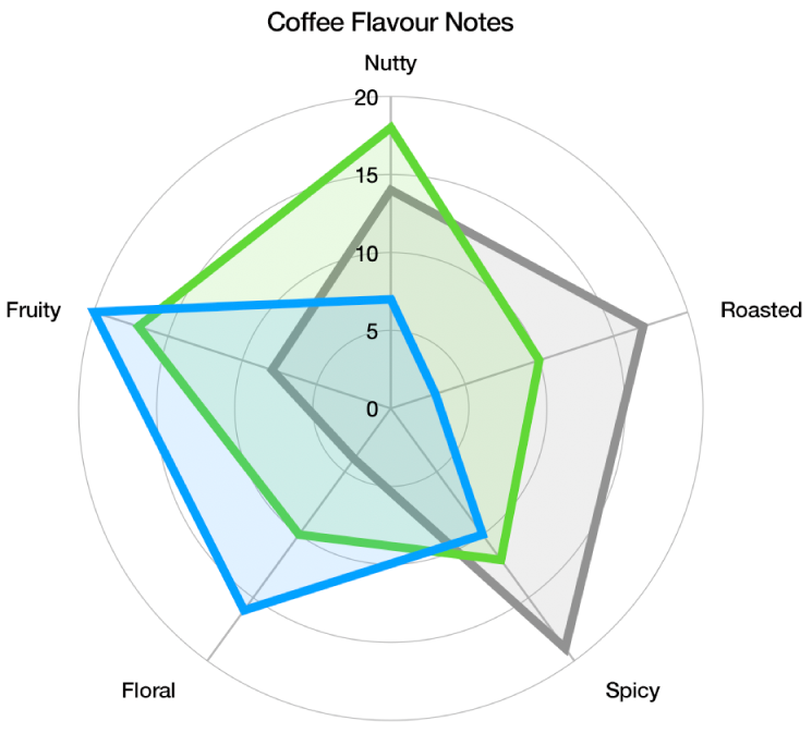
Tap the chart to select it, tap
 , then tap Chart.
Do any of the following:
Change the grid shape: Use the options below Grid Shape to choose whether you want the grid to be straight or curved.
Change the fill and stroke: Use the options below Style to choose whether you want all series to have a colour fill, a stroke along the edge or both.
If you can’t edit a chart, you may need to unlock it.