
Add or delete a graph in Pages on Mac
You can display your data using 2D, 3D and interactive graphs.
When you create a graph in Pages, you type graph data in the Graph Data editor (not in the graph itself). If you later make changes in the Graph Data editor, the graph updates automatically.
Add a column, bar, line, area, pie, or donut graph
Click
 in the toolbar, then click 2D, 3D or Interactive.
Click the left and right arrows to see more styles.
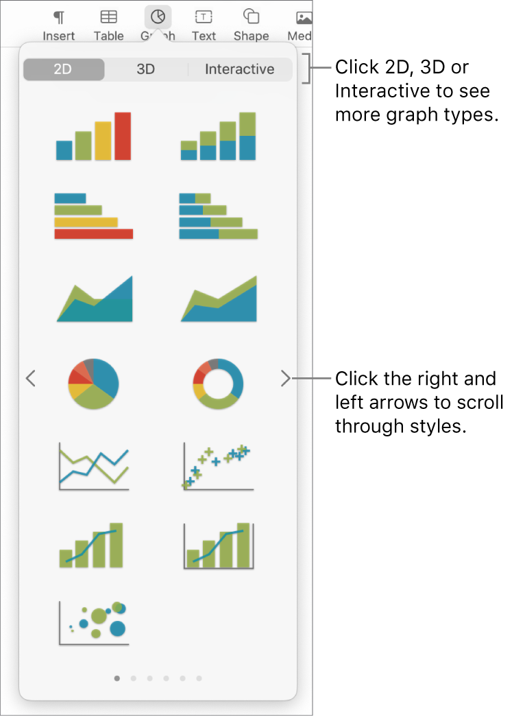
Click a graph or drag one to the page.
If you add a 3D graph, you see
 at its centre. Drag this control to adjust the graph’s orientation.
If you add a doughnut chart and want to resize the centre hole, click the Segments tab in the Format
 sidebar, then in the Inner Radius section of the sidebar, drag the slider or type a specific value.
To add data, click the graph, click the Edit Graph Data button near the graph, then enter your data in the Graph Data editor.
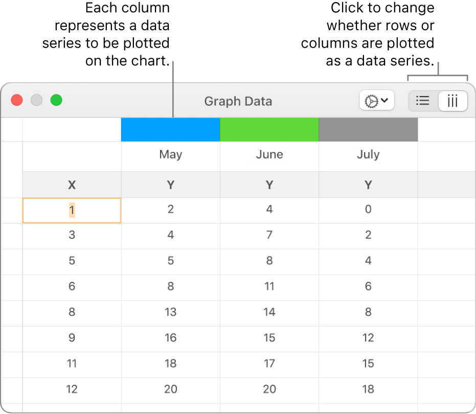
To change whether rows or columns are plotted as a data series, click one of the buttons in the top-right corner of the Chart Data editor.
Close the Graph Data editor to return to your graph.
Add scatter graph
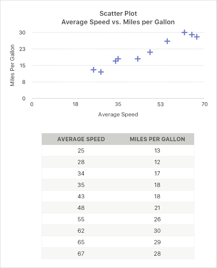
Scatter plots show relationships between two or more sets of data. They display data as points and require at least two columns or rows of data (x and y values) to plot values for a single data series. By default, each data series in a scatter plot shares the x-axis value, so you only need to add an additional row or column to show another data series.
The scatter plot below shows the correlation between driving speed and mileage (litres per kilometre).
Click
 in the toolbar, then click 2D or Interactive (there are no 3D scatter plots).
Click the right and left arrows to see more styles.
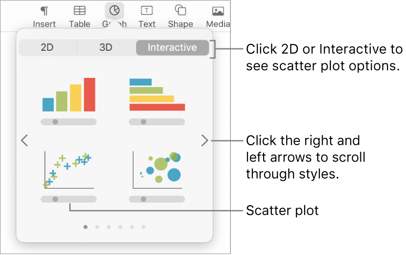
Click a scatter plot or drag one to the page.
To add data, click the graph, click Edit Graph Data, then enter your data in the Graph Data editor.
Each column represents a data series to be plotted on the chart.

Do any of the following:
Change whether rows or columns are plotted as a data series: Click one of the buttons in the top-right corner of the Graph Data editor.
Use a different x-axis value for each data series: Click
 , then deselect Share X Values. Click each cell to enter your own x and y values for the data series.
Add another data series: Type a new data series name in the next empty column (or row, if plotting by rows), then press Return.
Close the Graph Data editor to return to your graph.
Add bubble graph
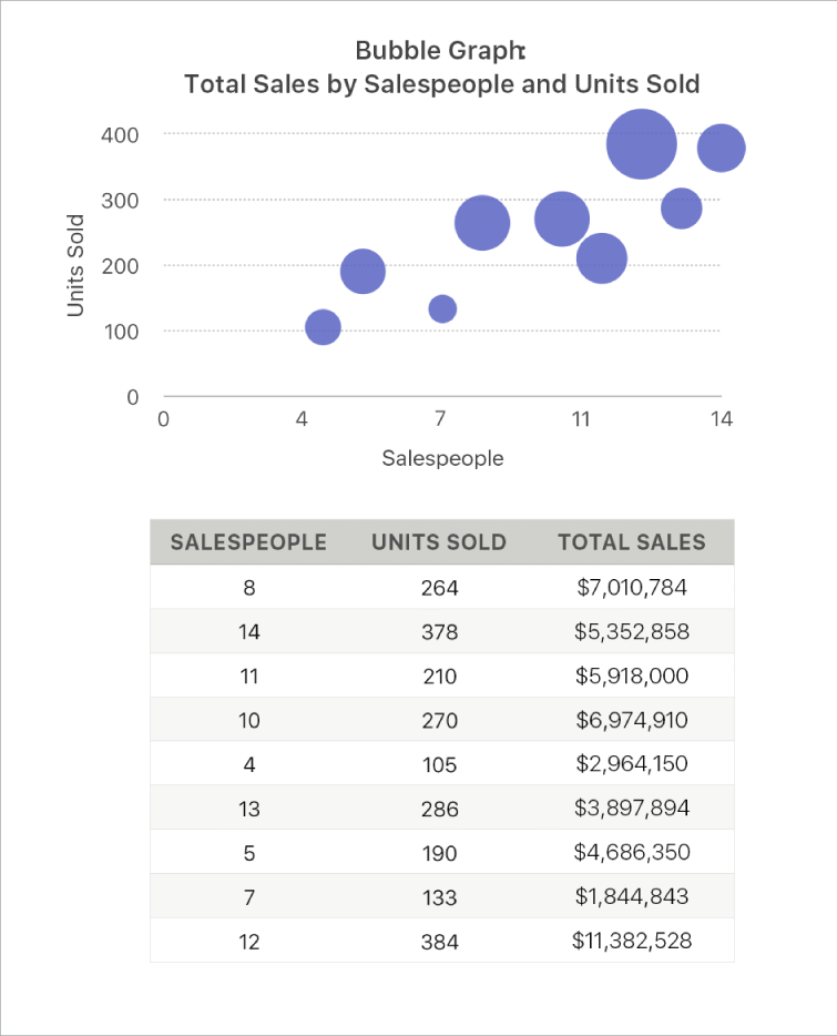
A bubble chart is a type of scatter plot in which the data are plotted as bubbles of varying sizes, rather than as points. In a bubble chart, each data series includes a third dimension that conveys the relationship between the compared values (x and y) and a size value (z). The size value determines the size of the bubble.
By default, each data series in a bubble chart shares the x-axis value, so you need to add only two additional rows or columns of data to show another data series. If you select to use independent x-axis values, you need to add three additional rows or columns (x, y and z) to show another data series.
The bubble chart below shows how the number of units sold (y) varies with the number of salespeople (x). The data is plotted as bubbles of varying sizes — the larger the bubble, the higher the total sales amount (z).
Click
 in the toolbar, then click 2D or Interactive.
Click the left and right arrows to see more styles.
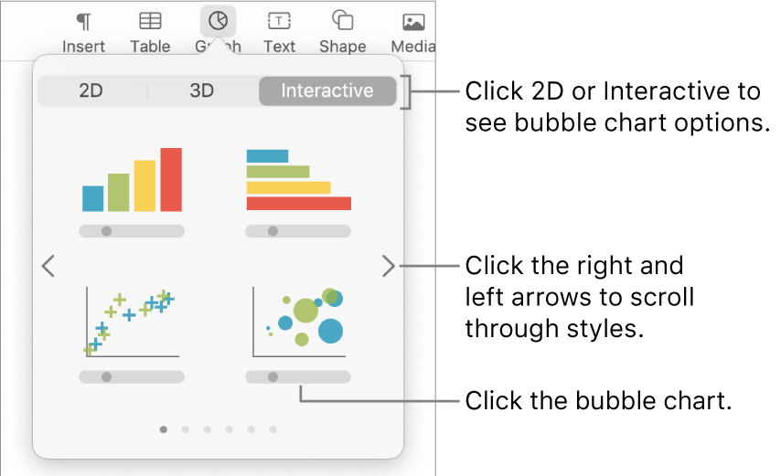
Click a bubble chart or drag one to the page.
To add data, click the graph, then click the Edit Graph Data button near the graph.
The Graph Data editor appears with placeholder data (x-axis, y-axis, and size values). Each column represents a data series to be plotted on the chart.

Click each cell to enter your own x, y and size values for the data series.
To add another data series, type a new data series name in the next empty column (or row, if plotting by rows), then press Return.
To change whether rows or columns are plotted as a data series, click one of the buttons at the top-right corner of the Graph Data editor.
If you don’t want to use the same x-axis values for each data series, click
 , then deselect Share X Values.
In the Format
 sidebar, click the Series tab.
In the Bubble Data section of the sidebar, click the size values pop-up menu, then select how you want to represent bubble size values (area or diameter).
To show bubbles with a negative value, select the “Show negative bubbles” tick box.
Close the Graph Data editor to return to your graph.
Add an interactive graph
An interactive graph presents data in stages so that you can emphasise the relationship between groups of data. Interactive charts can be used to show data such as sales by group over time, expenses by department and population changes by region per continent. The example below shows the growth of three species during a three-year period.
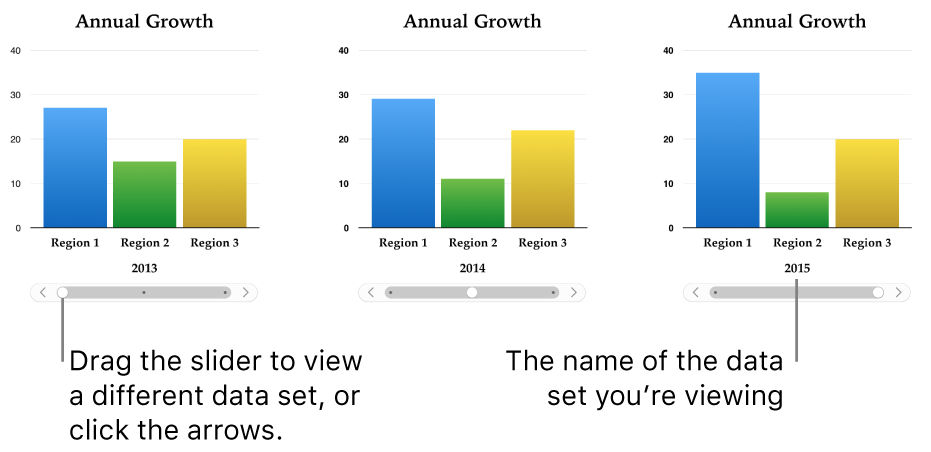
You can interact with the graph using a slider and buttons or buttons only.
Click
 in the toolbar, then click Interactive.
Click the right and left arrows to see more styles.
Click a graph or drag one to the page.
To add data, click the graph, click the Edit Graph Data button near the graph, then enter your data in the Graph Data editor.
You can add numbers, dates, durations, column and row headers in the data cells. To format the numbers, select the cells; in the Format
 sidebar, click the Series tab; then click the Value Labels pop-up menu.
To change whether rows or columns are plotted as a data series, click one of the buttons in the top-right corner of the Chart Data editor.
The data series are always plotted in an interactive graph, but each data set is displayed separately.
Close the Graph Data editor to return to your graph.
To change the type of control used for interacting with the graph, click the graph, then in the Format
 sidebar, click the Graph tab.
Click the pop-up menu below Interactive Graph and select Buttons Only.
Delete a graph
You can delete any chart in your document without affecting any table data.
Click the graph to select it, then press Delete on your keyboard.
Deleting the table data you used to create the graph doesn’t delete the graph; it simply clears the graph of all data.