OAuth guidelines for Health Records
OAuth guidelines overview
Most of the patient experience using Health Records is designed and implemented by Apple. The exception is the account authentication and authorization flow. That web-based OAuth 2.0 flow is the responsibility of your organization or your EHR vendor, and it’s a crucial part of the patient experience. By implementing the following guidelines, your organization can better accomplish the following goals:
Provide a strong first impression of your organization.
Prominently display your brand name and logo.
Engage patients who haven’t registered for a portal account.
Help resolve common authentication issues.
Describe to patients the purpose of the data access.
Drive patient portal adoption.
Reduce customer support requests.
General OAuth flow
Deliver a responsive, mobile-first design for the entire OAuth 2.0 flow by employing the following:
A simple, uncluttered layout
Targets large enough for fingers to easily tap
Font sizes appropriate for 4-inch screens
Your organization’s branding and colors
Avoid green-and-brown and blue-and-gray color combinations, because they aren’t accessible to color-blind users.
A single, primary action per step, with a secondary call as needed
To ease your patients’ path to the next step, avoid multiple button taps and avoid menus whose content is hidden by default.
Finally, use no large images or logos that result in unnecessary scrolling. Tall content may hide the sign-in button.
Sign-in page
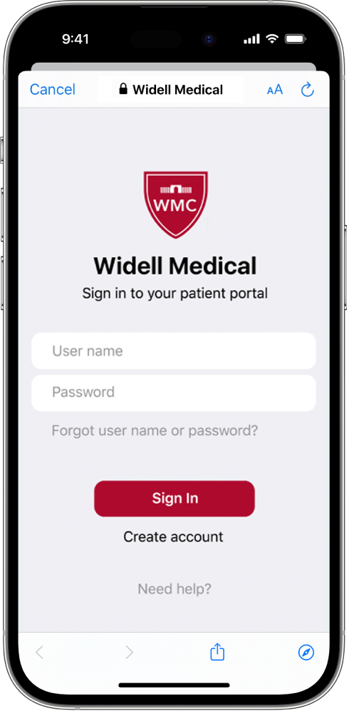
To help users who haven’t signed up for a patient portal account, include a button to create one.
Include basic troubleshooting mechanisms—for example, “forgot user name/password” links, a help page link, and your organization’s contact information.
Avoid displaying information about other features that make the OAuth flow confusing. For example, don’t include pop-up menus or popovers describing additional functionality.
Here’s a good example of a sign-in page.

Authorization page
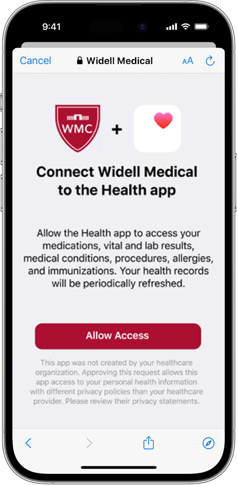
Minimize detailed legal text, which users usually don’t read but which often causes confusion if they do.
Here is some suggested text (which should be reviewed by your legal and marketing departments):
“This app was not created by your healthcare organization. Approving this request allows this app access to your personal health information with different privacy policies than those of your healthcare provider. Please review their privacy statements.”
Avoid displaying large images (for example, trademarked logos like the FHIR logo) that cause the authorization page to be confusing.
Here’s a good example of an authorization page.

Page loading and navigation
Ensure that the page loads quickly (in less than 1 second) by avoiding large files, such as a detailed background image.
Test the page with the latest version of iOS or iPadOS (using Safari) or with the latest version of macOS (using Responsive Design Mode in Safari on Mac).
Don’t use redirects to native mobile apps like a patient portal app. (Introducing custom URL scheme redirects can break the OAuth flow.)
Branding
To add credibility and make a positive impression, use an Extended Validation (EV) Certificate that includes the EHR or the health organization’s brand name.