Viewing timeline data
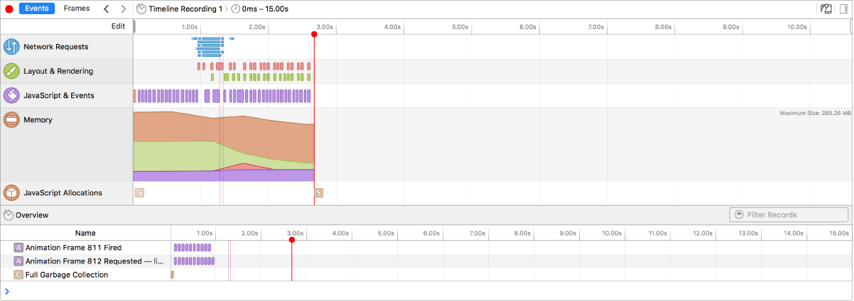
There are two views for timeline recording data: Events view and Frames view. Each instrument has an associated scale for the x-axis. For both the Events and Frames views, selecting a time range allows you to narrow down the data that will be presented in the table below the overview.
Events View

Instruments that use linear time for the x-axis are shown by default under the Events group.
The Events button enables the linear Events View. In this view, each data point indicates a distinct event triggered during the recording. (The exception to this is Memory, which shows a contiguous line of memory usage.) Events within web content happen on both very short and long timescales. Zoom in and out to change the scale of the overview. As the time scale changes, the ruler above the overview updates to show the x-value (time since the start of the recording) at each guideline. For Events view, zooming allows you to see short interactions more clearly.
Frames View

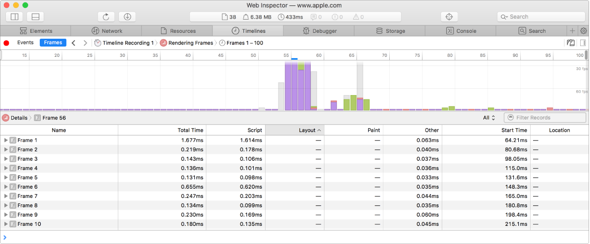
Instruments that use nonlinear scales are shown by selecting the Frames group.
The Frames button enables Frames or Rendering Frames instrument view. This instrument's timeline shows a bar graph, with each bar representing one rendered frame. The height of the bar for each frame indicates the frame time, or how long it took to render the frame. This view supports selecting a single frame by clicking it in the overview timeline, or by clicking the associated row in the data table. The selected frame is highlighted in blue. Specific activities are color-coded as follows:
Purple bars and detail rows represent JavaScript and event timers.
Green is used for compositing tasks.
Red is used for layout and rendering.
Gray is used for background engine work.
The 60fps and 30fps lines represent frame budgets; if the frame time is below the line, then they meet the frame budget and render at the expected rate. This allows you to easily see which frames take too long to render, and what tasks caused the frame to exceed its budget.