Create or delete a chart in Numbers for iCloud
Charts (such as column, bar, or pie charts) are created using data from a table. To create any type of chart, you select the data, then choose a chart style to display the data. When you make changes to the data in the table, the chart updates automatically.
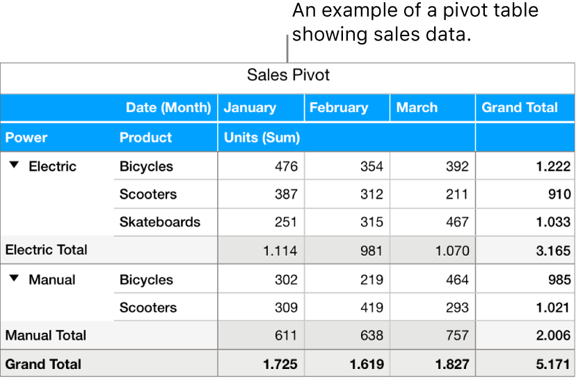
You can also create charts using the information in a pivot table.
Note: If you import a spreadsheet that contains a 3D chart into Numbers for iCloud, it’s displayed as a 2D chart, but the 3D information is saved. If you later open the spreadsheet using the Numbers app on a Mac, iPhone, or iPad, the chart appears in 3D again.
Create a column, bar, line, area, pie, donut, or radar chart
If the data you want to chart isn’t already in a table in the spreadsheet, add a table, then enter the data.
Depending on the data you want to plot, select the entire table, specific table cells, or one or more columns or rows of data.
If the data in your table is categorized, you can select a column to plot the results of a summary row calculation. To chart summary values for a subcategory, select the summary row cell at the level in the hierarchy you want to chart, then drag down to select summary row values for any additional groups you want to include in the chart.
Note: To chart individual data points in a categorized table, make sure the first cell in your selection is not in a summary row. If the selection includes a group that’s collapsed, only data from the visible groups is plotted.
Click the Chart button
 in the toolbar, click 2D or Interactive, then select a type of chart.
Note: Only column, bar, scatter, and bubble charts can be interactive.
Each row of data in the table represents a data series that’s plotted on the chart.
Note: If the range of cells you selected has more columns than rows, or if the range has the same number of columns and rows, the rows are plotted as the series.
Create a scatter chart
Scatter charts display data as points, and they require at least two columns or rows of data (x and y values) to plot values for a single data series. Each data series in a scatter chart shares the x-axis value, and therefore, you need to add only one additional row or column to show another data series.
If the data you want to chart isn’t already in a table in the spreadsheet, add a table, then enter the data.
Depending on the data you want to plot, select the table rows or columns that contain the data you want to use by clicking the numbered or lettered bar for those rows or columns.
A single data series with the same x and y values: The scatter chart plots the data similar to a line chart, with the values from the selected column along the both the x and y-axes.
A single data series with different x and y values: The scatter chart plots one data series. The first column selected determines the x-axis values and the second column determines the y-axis values.
Multiple data series: The first column selected determines the shared x-axis values and each additional column selected creates a new series (and determines the y-axis values for each series).
If the data in your table is categorized, you can select a column to plot the results of a summary row calculation. To chart summary values for a subcategory, select the summary row cell at the level in the hierarchy you want to chart, then drag down to select summary row values for any additional groups you want to include in the chart.
Note: To chart individual data points in a categorized table, make sure the first cell in your selection is not in a summary row. If the selection includes a group that’s collapsed, only data from the visible groups is plotted.
To plot the selected data, click the Chart button
 in the toolbar, click 2D or Interactive, then click the scatter chart.
Create a bubble chart
You can use a bubble chart to plot data with three dimensions. Each data series includes a third dimension that conveys the relationship between the compared values (x and y) and a size value (z). Each data series in a bubble chart shares the x-axis value, and therefore, you need to add two additional rows or columns to show another data series.
If the data isn’t already in a table in the spreadsheet, add a table, then enter the data.
Depending on the data you want to plot, select the table rows or columns with the data you want to use by clicking the numbered or lettered bar for those rows or columns:
A single data series with no size values: Select only a single column; the bubble chart plots the data similar to a line chart, with the values from the selected column along the y-axis.
A single data series with size values: Select three columns; the first column selected determines the x-axis values, the second column determines the y-axis values, and the third column determines the size of the bubble.
Multiple data series: Select the shared x value column and multiple pairs of additional columns. The first column selected determines the shared x-axis values, the second column determines the y-axis values for the first data series, and the third column determines the sizes of the bubbles (z) for the first data series. Select an additional two columns to add y and z values for a second data series, two more columns for a third data series, and so on.
If the data in your table is categorized, you can select a column to plot the results of a summary row calculation. To chart summary values for a subcategory, select the summary row cell at the level in the hierarchy you want to chart, then drag down to select summary row values for any additional groups you want to include in the chart.
Note: To chart individual data points in a categorized table, make sure the first cell in your selection is not in a summary row. If the selection includes a group that’s collapsed, only data from the visible groups is plotted.
Click the Chart button
 in the toolbar, click 2D or Interactive, then click the bubble chart.
Click Series at the top of the sidebar on the right, then choose Bubble Area or Bubble Diameter from the pop-up menu below Bubble Data.
To include bubbles with negative values, select the “Show negative bubbles” checkbox.
Create a chart from pivot table data
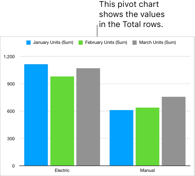
You can create a chart from the data in a pivot table to plot different data (such as Grand Totals) based on the cells you select. The pivot chart below displays the values in the Total rows (Electric and Manual) in the pivot table.


Select a cell that includes the values you want to plot.
Click the Chart button
 in the toolbar, click 2D or Interactive, then choose a type of chart.
For information about choosing the options for different types of charts, see the tasks above.
Delete a chart
Click the chart to select it, then press Delete.