Change how data is displayed in charts in Keynote for iCloud
You can highlight the data in a chart by changing the appearance, position, or spacing of one or more data series. A data series is the set of related values represented by each bar, pie slice, line, and so on, plotted on the chart.
Change the look of connection lines in line or scatter charts
You can show straight or curved connection lines in line or scatter charts, or remove the lines in scatter charts (so you see only the data points).
Change the position of pie chart wedges or donut chart segments
Select the pie or donut chart.
Do one of the following:
Reposition a wedge or segment: Click a wedge or segment, then drag it. To move multiple wedges or segments, Command-click (on a Mac) or Control-click (on a Windows device) the items, then drag.
Resize the center hole of a donut chart: Click Segments at the top of the Format
 sidebar on the right, then drag the Inner Radius slider.
Add rounded corners to bar or column charts
You can round the corners of the data series in any chart that contains bars or columns (Stacked Column, Mixed, 2-Axis, and so on).
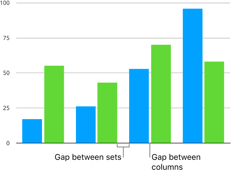
Change the spacing in bar or column charts
You can change the spacing of the data series in any chart that contains bars or columns (Stacked Column, Mixed, 2-Axis, and so on).
Add a shadow effect to the data series
You can add a shadow effect to the data series in any 2D chart, then customize its appearance and position.
