Change the look of graph text and labels in Pages on iPhone
You can change the look of graph text by applying a different style to it, changing its font, adding a border and more.
Change the font, style and size of graph text
You can change the look of all the graph text at once.
Tap the graph, then tap
 .
.Tap Style, then tap Labels.
Do any of the following:
Change the font: Tap Graph Font, then tap a font name.
If you don’t see Graph Font, swipe up from the bottom of the controls.
Change the font style: Tap Graph Font, tap
 next to the font name, then tap a style.
Make the font smaller or larger: Tap
 .
.All text in the graph increases or decreases proportionally (by the same percentage).
Tap
 to close the controls.
Edit the graph title
Graphs have a place holder title (Title) that’s hidden by default. You can show the graph title and change it.
Tap the graph, tap
 , then tap Graph.
Turn on Title.
To change the alignment of the title — so that it’s on the left of the graph, for example — tap Style, then choose an alignment option.
To move the title to the centre of a doughnut chart, tap Position, then tap Centre.
To edit the title, select the text, type a new title, then tap Done.
Add and modify graph value labels
Graphs have labels that show the values of specific data points. You can specify a format for them (for example, number, currency or percentage), change where they appear, how they look and more.

Tap the graph, tap
 , tap Style, then tap Labels.
 To add value labels, do one of the following:
For pie or doughnut charts: Turn on Values.
You can also display data labels in pie charts and doughnut charts by turning on Data Point Names.
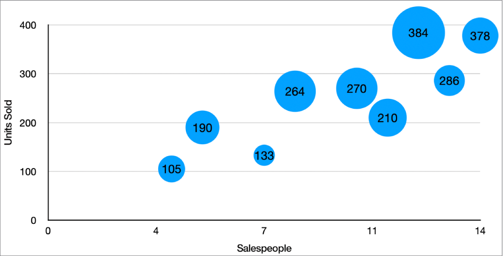
For bubble charts: Tap Values below Bubble Labels, then choose which values to display.
For scatter plots: Tap Values below Data Point Labels, then choose which values to display.
For other types of graphs: Tap Value Labels, then choose an option.
To fine-tune the value labels, tap Number Format, turn off Same as Source, then do any of the following (these controls are available only for some graph types):
Choose a format for the label: Tap a format (for example, Number, Currency or Percentage).
Set the number of decimal places: Tap
 , then tap the + or –.
Show the thousands separator: Tap
 , then turn on the Thousands Separator.
Choose how to display negative numbers: Tap
 , then choose “−100” or “(100)”.
Add a prefix or suffix: Enter text. It’s added to the beginning or end of the label.
Note: If you leave Same as Source turned on, the value labels are displayed in the same format as the source data in the original table.
To change the font, colour and style of all labels, use the controls at the top of the Labels tab.
To change the look for just the data series labels, tap Style below Series values (or below Data Point Labels for scatter plots, below Bubble Labels for bubble charts, or below Values for Pie and Doughnut charts), then do any of the following:
Change the font: Tap Font and choose a font, or tap to change the character style (such as bold or italic).
Change the text size: Tap the number and type a new size, or tap the – or + button next to Size.
Change the text colour: Tap the colour well, then tap Preset or Colour.
Add a shadow to the text: Turn on Shadow.
Note: The font for all labels changes when you change the Graph Font in the Style tab of the Format menu.
If you created a pie or doughnut chart, you can position the value and data labels, and add leader lines to connect them to their wedges or segments. In the Labels tab, tap Position, then do any of the following:
Change the position of the labels: Drag the Distance from Centre slider to set where the labels appear. Moving the labels further from the centre of the graph can help separate overlapping labels.
Add leader lines: Turn on Leader Lines, then tap Straight or Angled. (With angled leader lines, the callouts align into columns, as shown below.) You can change the line type, colour and width of the leader lines and add endpoints to them.
Modify axis labels
You can specify which labels appear on an axis, edit their names, and change their angle of orientation.
Tap the graph, then tap
 .
.Tap Style, then tap Labels.
Do any of the following:
Modify markings on the Category (x) axis: Tap Value Labels under Category (x).
Modify markings on the Value (y) axis: Tap Value Labels under Value (y).
Use the controls to make any adjustments.
If you turn on Axis Name, Pages adds a placeholder axis name to the chart. To change it, select the axis name, then type your own.
Note: Axis options may be different for scatter charts and bubble charts.
Add summary labels
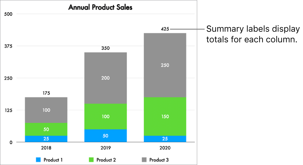
If you have a stacked column, stacked bar or stacked area graph, you can add a summary label to display the sum above each stack.

Tap the graph, tap
 , tap Style, then tap Labels.
Turn on Summary Labels. (You may need to scroll down.) Tap Number Format, then choose an option.
To fine-tune how the summary label values are displayed, tap
 next to your chosen number format and make your choices using the available options.
The options vary depending on the chosen summary label format. For example, when Currency is selected, you can choose the number of decimals, whether negative values appear in parentheses or with a negative sign, and the currency format.
To add a prefix or suffix to each summary label, tap Prefix or Suffix, then type the text you want to add.
To change the font, colour and style of the summary labels, tap Style below Number Format then use the controls to make changes.
Note: The font for all labels changes when you change the Graph Font in the Style tab of the Format menu.
To adjust the distance between the summary labels and graph, tap the – or + buttons next to Offset.
To add a caption or title to a graph, see Create a caption for an image or other object.