
Change the look of chart text and labels in Numbers on Mac
You can change the look of chart text by applying a different style to it, changing its font, adding a border, and more.
If you can’t edit a chart, you may need to unlock it.
Change the font, style, and size of chart text
You can change the look of all the chart text at once.
Click the chart, then in the Format
 sidebar, click the Chart tab.
Use the controls in the Chart Font section of the sidebar to do any of the following:
Change the font: Click the Chart Font pop-up menu and choose a font.
Change the character style: Click the pop-up menu below the font name and choose an option (Regular, Bold, and so on).
Make the font smaller or larger: Click the small A or the large A.
All text in the chart increases or decreases proportionally (by the same percentage).
To learn how to style the chart title and value labels so they look different from the other text, see the topics below.
Edit the chart title
Charts have a placeholder title (Title) that’s hidden by default. You can show the chart title and change it.
Click the chart.
In the Format
sidebar, click the Chart tab, then select the Title checkbox.Double-click the placeholder title on the chart and type your own.
To change the look of the title—for example, its font, size, and color—double-click the title again, then use the controls in the Chart Title tab of the sidebar to make changes.
To move the title to the center of a donut chart, click the Title Position pop-up menu, then choose Center.
Add and modify chart value labels
Charts have labels that show the values of specific data points. You can specify a format for them (for example, number, currency, or percentage), change where they appear or how they look, and more.
Click the chart, then in the Format
sidebar, do one of the following: For pie or donut charts: Click the Wedges or Segments tab.
For other chart types: Click the Series tab.
To add value labels and choose the format for the value (for example, Number, Currency, or Percentage), do one of the following:
For pie or donut charts: Select the Values checkbox, then click the disclosure arrow next to the Value Data Format pop-up menu and choose an option.
You can also display data labels in pie charts and donut charts by selecting the Data Point Names checkbox.
For bubble charts: Click the disclosure arrow next to Bubble Labels, select the checkbox next to Values, then click the Value Data Format pop-up menu and choose an option.
For scatter charts: Click the disclosure arrow next to Value Labels, select the checkbox next to Values, then click the Value Data Format pop-up menu and choose an option.
For other types of charts: Click the disclosure arrow next to Value Labels, then click the pop-up menu below and choose an option.
If you want the value labels to match the format of the original data in the table, choose Same as Source Data.
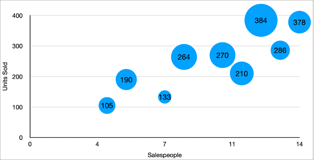
Tip: To add a value label to just one item in a chart—for example, one wedge in a pie chart—first select the item, then add the value label.
Fine-tune the value labels (these controls are available only for some chart types):
Set the number of decimal places: Click the up or down arrow.
Choose how to display negative numbers: Choose “-100” or “(100).”
Show the thousands separator: Select the Thousands Separator checkbox.
Add a prefix or suffix: Enter text. It’s added to the beginning or end of the label.
Specify where labels appear: Click the Location pop-up menu and choose an option, such as Top, Middle, Above, or Inside (the options depend on your chart type).
When you create a chart, Auto-Fit is automatically turned on to prevent value labels from overlapping. To see all value labels, deselect the Auto-Fit checkbox. (Not all charts have an Auto-Fit checkbox.)
To change the font, color, and style of the labels, click any value or data label on the chart, then use the controls in the Font section of the sidebar to make changes.
To change the look of labels for just one data series, first select the series, then make changes. To select multiple series, click a value label, then Command-click a value label in another series. To select all series, click a value label, then press Command-A.
Note: The font for all labels changes when you change the Chart Font in the Chart tab of the Format sidebar.
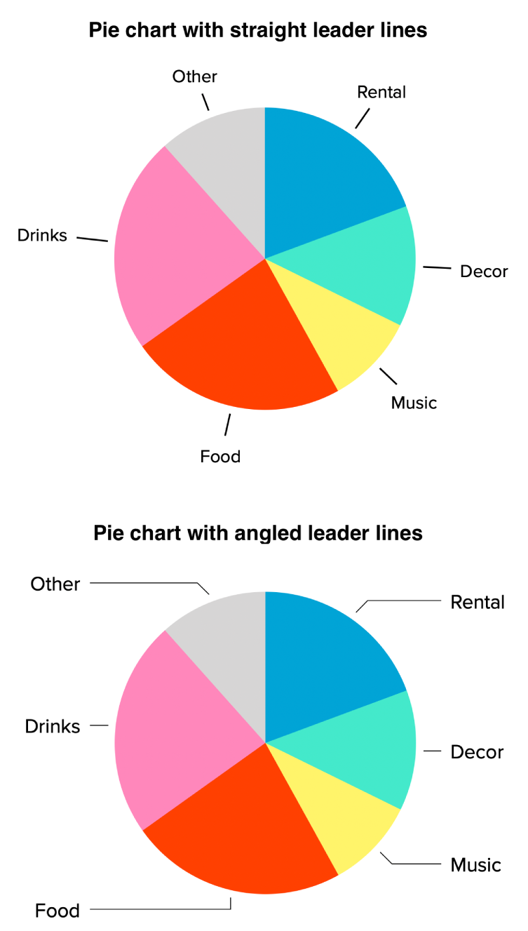
To position value and data labels in a pie or donut chart, and add leader lines to them, click the disclosure arrow next to Label Options, then do any of the following:
Change the position of the labels: Drag the Distance from Center slider to set where the labels appear. Moving the labels farther from the center of the chart can help separate overlapping labels.
Add leader lines: Select the Leader Lines checkbox. You can change the line type, color, and width of the leader lines and add endpoints to them.
Choose leader line form: Click the pop-up menu and choose Straight or Angled. With angled leader lines, the callouts align into columns, as shown below.
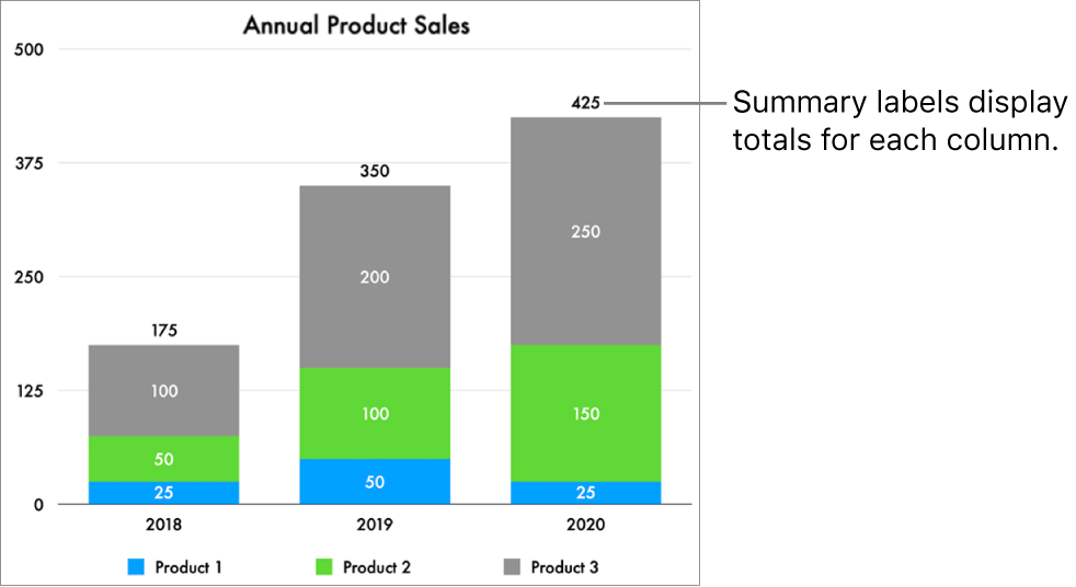
Add summary labels
If you have a stacked column, stacked bar, or stacked area chart, you can add a summary label to display the sum above each stack.
Click the stacked chart, then in the Format
sidebar, click the Series tab.Click the pop-up menu under Summary Labels, then choose a number format for the label.
Turn on Same as Source to use the same number format as the chart data.
To fine-tune how the summary label values are displayed, make your choices using the options that appear below the Summary Labels pop-up menu.
The options vary depending on the chosen summary label format. For example, when Currency is selected, you can choose the number of decimals, whether negative values appear in parentheses or with a negative sign, and the currency format.
To add a prefix or suffix to each summary label, type the text you want to add in the fields below Prefix or Suffix.
To change the font, color, and style of the summary labels, click any summary label on the chart, then use the controls in the Font section of the Format
sidebar to make changes.Note: The font for all labels changes when you change the Chart Font in the Chart tab of the Format sidebar.
To adjust the distance between the summary labels and the stacks, click the up or down arrows next to Offset.
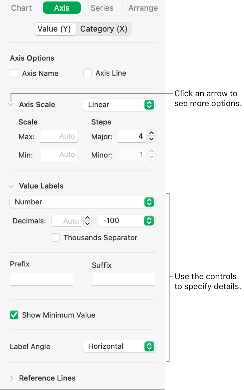
Modify axis labels
You can specify which labels appear on an axis, edit their names, and change their angle of orientation.
Click the chart, then in the Format
sidebar, click the Axis tab.Do either of the following:
Modify markings on the value axis: Click the Value (Y) button near the top of the sidebar.
Modify markings on the category axis: Click the Category (X) button near the top of the sidebar.
Use the controls in the sidebar to make any adjustments.
To see all options, click the disclosure arrows to the left of the section headings.
If you selected the Axis Name checkbox and want to change the name on the chart, click the chart, double-click the axis name on the chart, then type your own.
To change the font, color, and style of axis labels, click an axis label, then use the controls in the Font section of the sidebar to make changes.
Edit pivot chart data labels
You can edit the labels shown in a pivot chart. For example, you can show the group names from the pivot table on the x-axis. To learn how to create a pivot chart using a pivot table, see Select cells in a pivot table to create a pivot chart.
Select the pivot chart you want to edit.
In the Chart tab of the Format
sidebar, click the Pivot Data Labels pop-up menu, then choose the names you want to show, or choose Hide All Names.Note: The options you see in Pivot Data Labels may change based on the fields in the pivot table.
Note: Axis options may be different for scatter and bubble charts.
To add a caption or title to a chart, see Add a caption or title to objects in Numbers on Mac.
You can save a chart’s look as a new style.