
Add or delete a chart in Keynote on Mac
When you create a chart in Keynote, you type chart data in the Chart Data editor (not in the chart itself). If you later make changes in the Chart Data editor, the chart updates automatically.
Add a column, bar, line, area, pie, or donut chart
Click
 in the toolbar, then click 2D, 3D, or Interactive to see different chart types.
Click the left and right arrows to see more styles.
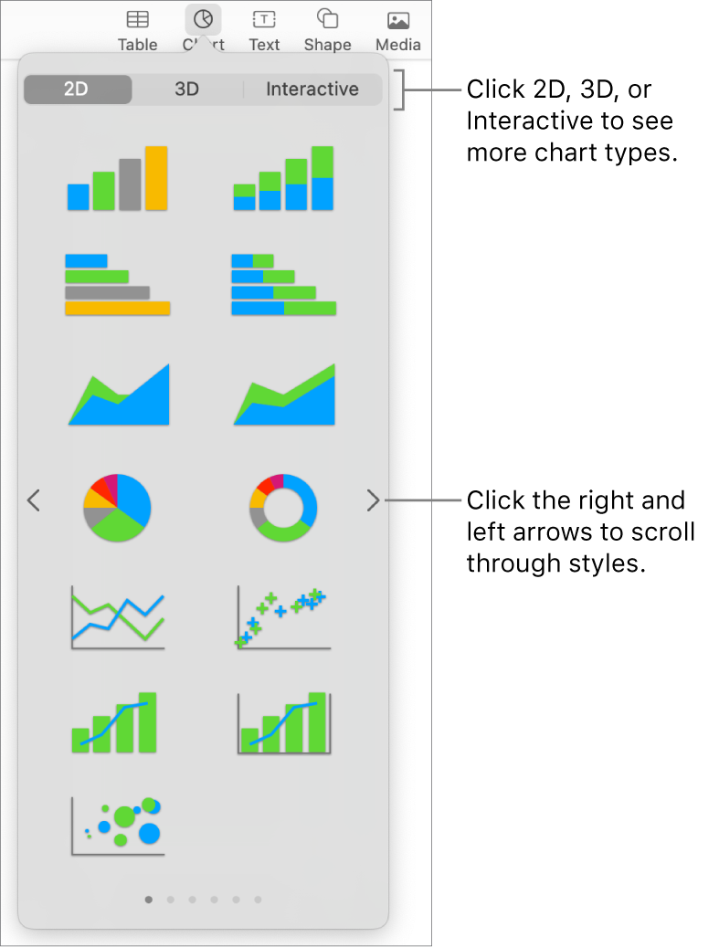
Click a chart to add it to the slide.
If you add a 3D chart, you see
 at its center. Drag this control to adjust the chart’s orientation.
If you add a donut chart and want to resize the center hole, click the Segments tab in the Format
 sidebar, then in the Inner Radius section of the sidebar, drag the slider or type a specific value.
To add data, click the chart, click the Edit Chart Data button near the chart, then enter your data in the Chart Data editor.
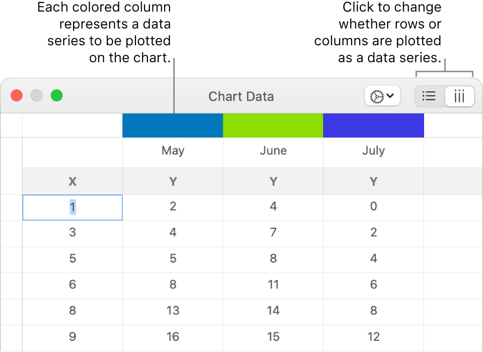
To change whether rows or columns are plotted as a data series, click one of the buttons at the top-right corner of the table.
Close the Chart Data editor to return to your chart.
Add scatter charts
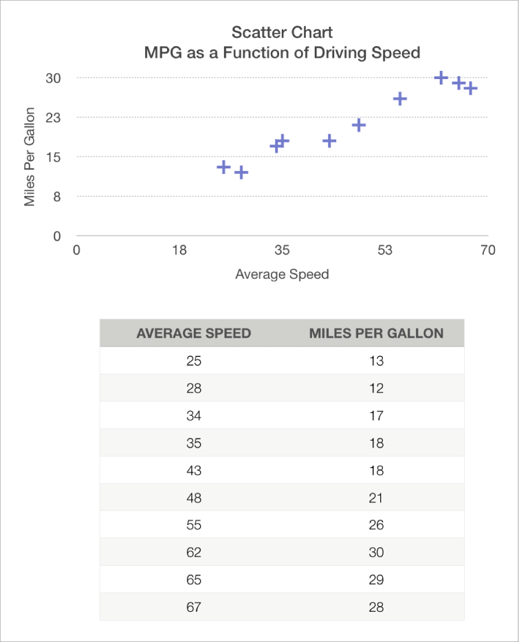
Scatter charts show relationships between two or more sets of data. They display data as points and require at least two columns or rows of data (x and y values) to plot values for a single data series. By default, each data series in a scatter chart shares the x-axis value, so you need to add only an additional row or column to show another data series.
The scatter chart below shows the correlation between driving speed and gas mileage (miles per gallon).
Click
 in the toolbar, then click 2D or Interactive (there are no 3D scatter charts).
Click the right and left arrows to see more styles.
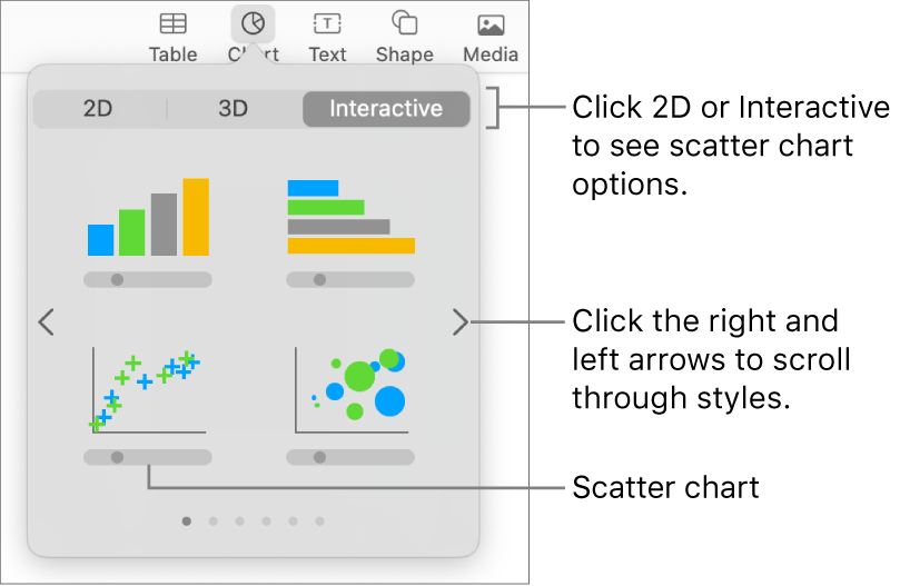
Click a scatter chart or drag one to the slide.
To add data, click the chart, click Edit Chart Data, then enter your data in the Chart Data editor.
Each colored row or column represents a data series to be plotted on the chart.

Do any of the following:
Change whether rows or columns are plotted as a data series: Click one of the buttons in the top-right corner of the Chart Data editor.
Use a different x-axis value for each data series: Click
 , then deselect Share X Values. Click each cell to enter your own x and y values for the data series.
Add another data series: Type a new data series name in the next empty column (or row, if plotting by rows), then press Return.
Close the Chart Data editor to return to your chart.
Add bubble charts
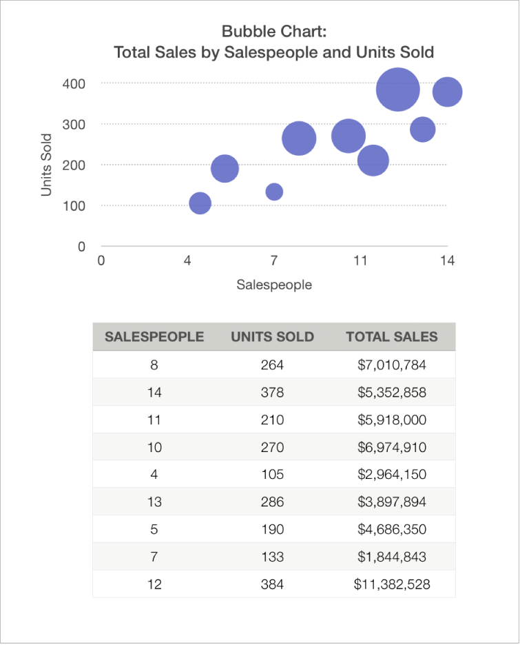
A bubble chart is a type of scatter chart in which the data are plotted as bubbles, rather than as points. You can use a bubble chart to plot data with three dimensions. Each data series includes a third dimension that conveys the relationship between the compared values (x and y) and a size value (z). The size value determines the size of the bubble.
By default, each data series in a bubble chart shares the x-axis value, so you need to add only two additional rows or columns of data to show another data series. If you choose to use independent x-axis values, you need to add three additional rows or columns (x, y, and z) to show another data series.
The bubble chart below shows how the number of units sold (y) varies with the number of salespeople (x). The data is plotted as bubbles of varying sizes—the larger the bubble, the higher the total sales amount (z).
Click
 in the toolbar, then click 2D or Interactive.
Click the left and right arrows to see more styles.
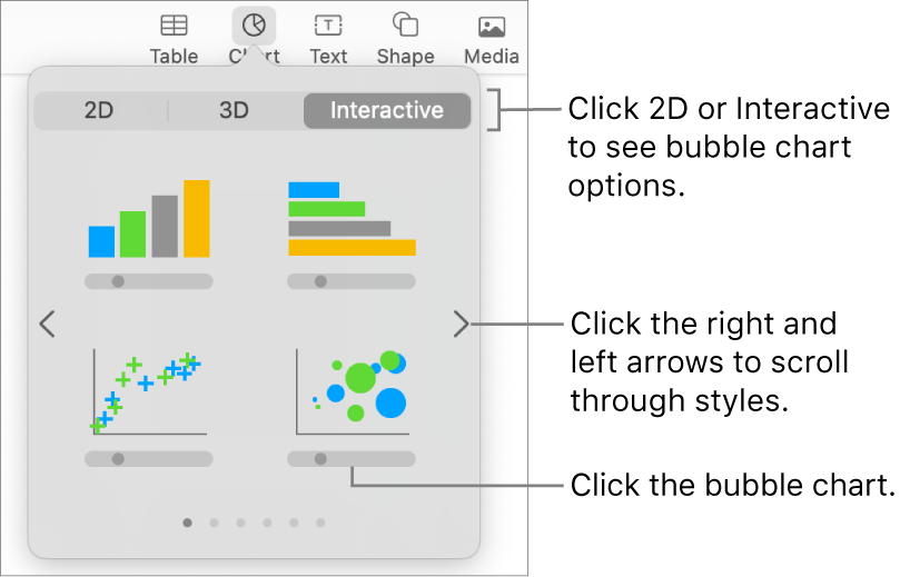
Click a bubble chart or drag one to the slide.
To add data, click the chart, then click the Edit Chart Data button near the chart.
The Chart Data editor appears with placeholder data (x-axis, y-axis, and size values). Each colored column represents a data series to be plotted on the chart.

Click each cell to enter your own x, y, and size values for the data series.
To add another data series, type a new data series name in the next empty column (or row, if plotting by rows), then press Return.
To change whether rows or columns are plotted as a data series, click one of the buttons at the top-right corner of the Chart Data Editor.
If you don’t want to use the same x-axis values for each data series, click
 , then deselect Share X Values.
In the Format
 sidebar, click the Series tab.
In the Bubble Data section of the sidebar, click the size values pop-up menu, then choose how you want to represent bubble size values (area or diameter).
To show bubbles with a negative value, select the “Show negative bubbles” checkbox.
Close the Chart Data editor to return to your chart.
Add an interactive chart
Interactive charts can be used to show data such as sales by group over time, expenses by department, and population changes by region per continent. The example below shows the growth of three species during a three-year period.
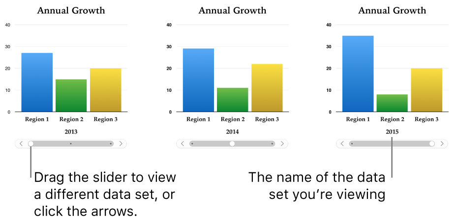
You can interact with the chart using a slider and buttons or buttons only.
Click
 in the toolbar, then click Interactive
Click the right and left arrows to see more styles.
Click a chart or drag one to the slide.
To add data, click the chart, click the Edit Chart Data button near the chart, then enter your data in the Chart Data editor.
You can add numbers, dates, durations, and column and row headers in the data cells. To format the numbers, select the cells; in the Format
 sidebar, click the Series tab; then click the Value Labels pop-up menu.
To change whether rows or columns are plotted as a data series, click one of the buttons at the top-right corner of the Chart Data editor.
The data series are always plotted in an interactive chart, but each data set is displayed separately.
Close the Chart Data editor to return to your chart.
To change the type of control used for interacting with the chart, click the chart, then in the Format
 sidebar, click the Chart tab.
Click the pop-up menu below Interactive Chart and choose Buttons Only.
You can add a Magic Chart build effect to an interactive chart, which animates the different chart data series. See the task below.
Add a Magic Chart effect to an interactive chart
You can animate the different data series in a chart with a Magic Chart build effect.
Click the interactive chart.
In the Animate
 sidebar, click the Build In tab.
Click the Build Order button at the bottom of the sidebar, then click your chart in the Build Order list.
Click the Start menu, then choose an option:
On Click: The Magic Chart effect plays when you click on the slide during the presentation.
After Transition: The Magic Chart effect builds and plays when the slide opens during the presentation.
Click Preview to see an animated display of your chart’s data series.
Delete a chart
Click the chart to select it, then press Delete on your keyboard.